All components
Vertical accordions
Buttons
Buttons Dark
Toasts
Default
Default without icon
Small
Add .toast--small
Header
Tooltips
If using arrow-down-1 icon, this one will rotate when clicked.
Make sure data-tootlip-instance is unique
Refer to tippy doc for data-tooltip-placement="bottom-start" data-tooltip-event-trigger value
This is a test 2
At vero eos et accusamus et iusto odio dignissimos ducimus qui blanditiis praesentium voluptatum deleniti atque corrupti quos dolores et quas molestias
This is a test 2
At vero eos et accusamus et iusto odio dignissimos ducimus qui blanditiis praesentium voluptatum deleniti atque corrupti quos dolores et quas molestias
This is a helper box
At vero eos et accusamus et iusto odio dignissimos ducimus qui blanditiis praesentium voluptatum deleniti atque corrupti quos dolores et quas molestias
This is a helper box
At vero eos et accusamus et iusto odio dignissimos ducimus qui blanditiis praesentium voluptatum deleniti atque corrupti quos dolores et quas molestias
Edit date
This is a test 3
At vero eos et accusamus et iusto odio dignissimos ducimus qui blanditiis praesentium voluptatum deleniti atque corrupti quos dolores et quas molestias
Tabs
Use data-event="click" or data-event="mouseover" to change the trigger behavior (changing tabs by clicking or hovergin the list items)
data-event="mouseover"
data-event="click"
Messages bubble
Mega menu
Documentation
Dependency: Is using Tabs component
Pills
Pills Standard size
Pills Small size
Pills counter
Notification pills
Pills default and floating inside buttons
Mon panier
2
Ajouter au panier
1
Mon panier
8
Mon panier
8
Mon panier
2
Notifications
21
Notifications
2
Close-from-element floating pill
Navigation buttons
Prices
Prices Large
Prices Default
Prices Small
Cards
Card Product
Card Product row slider
Card Product with slider
Card Product with light box
In order to use GLightbox, the class .glightboxes must be set on the englobing element of the image(s) or slider if there's any.
Then, the image, or each images, must be wrapped in <a></a> tag with the href attribute holding the url of the image.
Finally, this link or each of those links must have the class .glightbox.
Card link
Audio - Vidéo - Téléphonie
Audio - Vidéo - Téléphonie
Audio - Vidéo - Téléphonie
Audio - Vidéo - Téléphonie
Audio - Vidéo - Téléphonie
Audio - Vidéo - Téléphonie
Card link light
User t-sp--auto if image list might be not set.
TODO: à ajouter dans la classe .card-link
Card link with submenu
First, add cardSubMenus to the closest parent of the card link items
If the card contains a submenu, the .card element has to be a div.
In the same way, if the card has no submenu, the .card element has to be a link (a) with href
theme: light

Ecouteurs
Ecouteurs
Ecouteurs
Ecouteurs
Ecouteurs
Ecouteurs
Ecouteurs
Ecouteurs
Ecouteurs
theme: default
Ecouteurs
Ecouteurs
Ecouteurs
Ecouteurs
Carousels
If the carousel misses an image, a blank display can be put on.
Add the class image-blank right on the concerned swiper-slide.
Then, replace the img tag with the span and its classes and content.
Autoplay is active by default. You can turn it off by adding the custom-attributes data-setting-autoplay to false.
Les Deals du moment
-15, -30 et -50% sur toute une sélection d'articles. Profitez en!
Voir les produitsCarousel condensed
Carousel expanded
Carousel expanded without navigation
data-setting-navigation=false on .caroussel
Breadcrumbs
Inputs
Number input
Field group (pre-title + quantity buttons)
Forms (light and dark)
Forms (disabled)
In addition to the class .field--disabled on the container, set the disabled attribute on the input tag.
Field groups (pre-title + quantity buttons)
Pre-title optionnal of every type of input
Quantity buttons optionnal of type number fields
Date picker
Typography set
h1+ — Whereas recognition
h1 — Whereas recognition of the inherent
h2 — Whereas recognition of the inherent dignity
h3 — Whereas recognition of the inherent dignity
h4 — Whereas recognition of the inherent dignity
h5 — Whereas recognition of the inherent dignity
p — Lorem ipsum dolor sit amet, consectetur adipiscing elit, sed do eiusmod tempor incididunt ut labore et dolore magna aliqua. Ut enim ad minim veniam, quis nostrud exercitation ullamco laboris nisi ut aliquip ex ea commodo consequat. Duis aute irure dolor in reprehenderit in voluptate velit esse cillum dolore eu fugiat nulla pariatur. Excepteur sint occaecat cupidatat non proident, sunt in culpa qui officia deserunt mollit anim id est laborum.
p xs — Lorem ipsum dolor sit amet, consectetur adipiscing elit, sed do eiusmod tempor incididunt ut labore et dolore magna aliqua. Ut enim ad minim veniam, quis nostrud exercitation ullamco laboris nisi ut aliquip ex ea commodo consequat. Duis aute irure dolor in reprehenderit in voluptate velit esse cillum dolore eu fugiat nulla pariatur. Excepteur sint occaecat cupidatat non proident, sunt in culpa qui officia deserunt mollit anim id est laborum.
p 2xs — Lorem ipsum dolor sit amet, consectetur adipiscing elit, sed do eiusmod tempor incididunt ut labore et dolore magna aliqua. Ut enim ad minim veniam.
Space classes
Bottom space
Top space
Grid system
Loader
Use .loaderAnchor class on the direct parent of the content that is loading.
.loaderPage can be used only once per page at the top of the DOM.
.loaderSection can be used as many times as necessary on a page.
Add .hide class to hide the loader when the ajax is complete.
Table
A table cells can expand to cover 2 or more columns and/or rows.
If the attributes are used, the total number of cells will have to be adjusted accordingly.
Default table
| Title | Header | Header | Last check | Actions | |
|---|---|---|---|---|---|
| Data | Data | Data | Data |
|
|
| Data | Data | Data |
|
||
| Data | Data | Data | Data |
|
|
| Data | Data | Data | Data |
|
|
| Footer | Footer | Footer | Footer | Footer | |
Pyjama table
| Title | Header | Header | Last check | Actions | |
|---|---|---|---|---|---|
| Data | Data | Data | Data |
|
|
| Data | Data | Data |
|
||
| Data | Data | Data | Data |
|
|
| Data | Data | Data | Data |
|
|
| Footer | Footer | Footer | Footer | Footer | |
Bordered table
| Title | Header | Header | Last check | Actions | |
|---|---|---|---|---|---|
| Data | Data | Data | Data |
|
|
| Data | Data | Data |
|
||
| Data | Data | Data | Data |
|
|
| Data | Data | Data | Data |
|
|
| Footer | Footer | Footer | Footer | Footer | |
Composition
Product Detailed - Composition
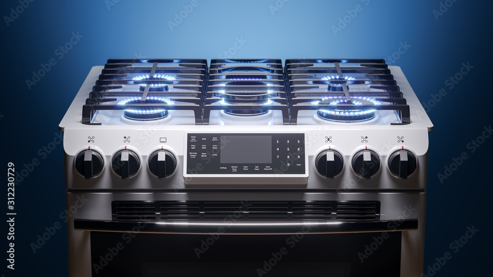
Fours / Appareils colonne AEG CIB6646ABM
Cuisinière avec table de cuisson à induction et four à air pulsé multifonctionel / 60cm / SteamBake / inox A AEG
- 2OE 045103601D
- 2OE 045103603D
Références producteurs :
Lorem ipsum dolor es
Product Detailed (with slider) - Composition
Fours / Appareils colonne AEG CIB6646ABM
Cuisinière avec table de cuisson à induction et four à air pulsé multifonctionel / 60cm / SteamBake / inox A AEG
- 2OE 045103601D
- 2OE 045103603D
Références producteurs :
Lorem ipsum dolor es